Showing posts with label intaglio print. Show all posts

Thursday, December 3, 2015

Happy Holiday!

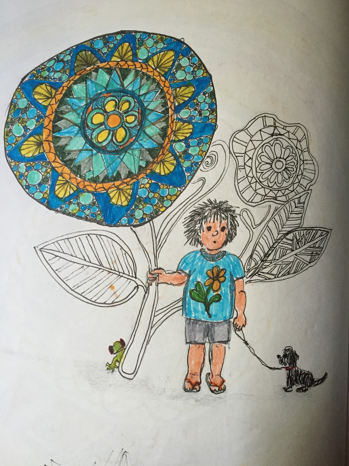
Here are those kids again!  They seem to have moved into my imagination and plan to stay there.
This is one of those times when I really need your input, if you would please.  What do you think of this direction?  Is it silly, simplistic, fun, funny, has possibilities, or junk this stupid idea right now.

The Giant's garden: Christmas Morning is the latest in this series:


The kids all seem to be pretty happy with what they've found - the puppy has yet to open her gift and is a little anxious about the whole affair.  The frog just watches.  And I'm wondering if I should be making these as woodblock prints, or doing them at all.

I'll be eagerly awaiting your ideas and comments and if they are not pats on the back, but more like pats on the head, I promise not to send the Art Exterminators after you --  ;-)

Sunday, November 8, 2015

Where did this come from?

Surprise!  I know -- it has been many moons since I've sat down to actually do a blog entry (as opposed to thinking about doing a blog entry).  Last winter I broke my shoulder, actually gumming up the rotator cuff, and causing it to scream some of the most obscene obscenities.  The result has been the better part of a year with no production.  The first quarter of the year I was stumbling around with a blank mind -- absolutely nothing going on up there. The skull functioned purely as a place to stick my face and place a gob of hair on it.

Finally, at some point in the Spring, the urge to sketch and think about getting back to work happened. Maybe it was Maria's Peace Puzzle piece arriving and needing to have something drawn and carved, or maybe it was the longer days and more sunlight.  Maybe I was suffering from SAD (Seasonal Affective Disorder). Whatever it was I started sketching every evening while propped in front of the TV.  Mostly it was Zentangle type things, but then children started entering the scene.  I have no idea where they came from, but more and more of them kept appearing.


 And then, the strangest thing of all happened, they started interfacing with the medallion/mandala drawings and the next thing I knew there were children playing in the Giant's Garden.


One of the galleries where I show my work has a Salon group which meets once a month and anyone having any questions, or just wanting to socialize, can bring a work needing a critique.  So, one Sunday I took my sketchbook and asked the group what they thought of my kids.  Maybe they were just being kind to an older person with her arm in a sling, but they all encouraged me to go on and see what I could do with them.  And this is what came of that.

Many more sketches ensued and finally I got up enough gumption to actually place one of the kids on a Solarplate and make an intaglio print.  And so here we have the result of that action:

It is actually on BFK and considerably lighter and more black and white than this, but you get the idea; fairly boring and not all that much fun. Mostly a gabble of lines and confusion.  So, we add a little color.  Considering the cost of plates and making one for each color, more or less, I opted for hand color.  What I didn't consider when making that decision was that it would have to be done with a brush with three hairs and would take all day.  Other than that everything was perfect.  Here's the result of one day of coloring, more or less:

The Giant's Garden:  Tea Time
6" x 8"
It will be a very small edition - depending on how long I am willing to sit and color!  Many activities have been taking place in the Garden.  The Giant must be a very gentle and generous being, but it has told the kids that they can play as much as they want.  And, they will! And, they are!

Friday, February 27, 2015

Yet More Superb Starling and The Hunt For Iridescence

You're probably thinking that I'm beating this poor old Starling print to death, but I wanted to share a few new things I learned on the way to finally getting an iridescent Superb Starling.  I had tried everything from soup to nuts including several different inks, mixing mica with the ink, mixing gold powder in the ink, chine colléing (is that a verb?) several different papers, and finally cutting a stencil and applying the mica on top of the wet Akua ink.  Bologna! Nothing achieved the effect I wanted or came close to the bird I was trying to replicate.  And then - whoopee!  I discovered this wonderful paper at a local art store - it is --- IRIDESCENT!!  Wowie - I could hardly wait to try it.

It is listed as Purple Somethingorother, and it can be solid purple until you move and then this luscious limey green appears, and some turquoise and some gold, or wait maybe that's pink.  It is amazing.  The red paper under it is regular red mulberry.  Well, I got right to work cutting out little bird bodies and red breasts.  And then I tried to print.  Surprise!  Ink printed everywhere, but none on the bird body.  This wonderful paper would not accept ink!  What the ...? 

Phooey, (or similar exclamation) as we seasoned printmakers like to say at times like these.  I gave up on that process for the moment.  On the same day that I bought the problem paper I also bought some plain white lacy papers with the intent of exposing them onto solar plates and using them as background texture.  The first exposure went as usual: nothing on the plate.  Not to be discouraged I inked some of the paper with black ink, exposed again and voila!  Perfect.  So, that is what I used for the background on this Starling print. 

Now back to the reason for the Phooey (it's a technical term) statement.  I put the Akua inks away and went back to the old standby: Gamblin Artist Colors Portland Black.  Same result - ink everywhere but on the iridescent wonderful glorious paper which is now causing me to become mildly irate.  Back on to the shelf it went and down came the Litho Roll Up ink - the muscle bound, body builder of inks. Yes!  A little difficult to maneuver, a bugger to wipe, but it prints beautifully on my wonderful heart fulfilling purply-green-turquoise, gold, pinkey paper.  Yaha!  We have success, Houston!  Not the best photo - ignore the shadow in the lower corner -


It is still difficult to see the iridescent quality in a photo - maybe you just have to take my word for it or maybe it will be more evident if you click on it and see it larger.  Or, maybe this little close-up will help  (there's darned shadow again, darn it) -


Yeah, I think you can see the sparkle in his coat in this close up.  The detail of the background from the lacy paper shows up, too.

So, those are my recent successes, you really don't want to see all the failures that transpired during the trip to the final printing of the Superb Starling.  I'm confident that all the East Africans from Kenya and Tanzania will approve of my take on their resident bird.

My apologies to all my woodblock buddies - this is not a woodblock, but it could have been!  And, maybe my struggles with the ink and chine collé will help you someday - maybe - could happen -
forgive??

Tuesday, December 2, 2014

Startled Starling

When we left off we had two transparencies ready to expose.  We exposed and then had: 2  exposed plates which I'm sure I photographed, but can't find and so we're moving to the next bit.

First, the background plate was inked.  It may be hard to determine in this photo, but the dots are an aqua blue with a lime green surface roll.


Two stencils were cut, one with the bird, and the bird.  (Sorry, I forgot to rotate this one -)


 The one without the bird was placed on the inked background plate

And, then the one with the bird was inserted and the one without was removed leaving the bird stencil in place.  Now we're ready to print this plate leaving a white space for the bird.


A little ink has come through in the white space, but it won't matter since it will be covered by the bird.


Next, we ink the bird plate


And cut out the two chine collé pieces from very thin Japanese papers: (oops, forgot to rotate again!)


And, after applying glue to the wrong side of the papers, but placing glue side up, they are placed on the plate in the proper place where they will stay if they know what's good for them.


This is placed on the press bed in the registration jig aka blue masking tape:


And, the print paper with the background lowered into place, run through the press and voila!


We have a Superb Starling. 

Superb Starlings are all over Tanzania - like Seagulls at the beach.  Every rest stop is well populated as they scrounge for tidbits of dropped or discarded food.  But, they are gorgeous.  They are much more iridescent.  I was unable to get any combo of ink with gold powder, or mica, to achieve the desired effect, but maybe I can find a paper which will do the trick on my next trip to Portland.


Wednesday, November 26, 2014

A Little of Everything

If a person were to judge the activity here from the number of posts it would appear that most of the time there is absolute quiet.  However, even though we don't make much noise, several things have been on-going.  Firstly, there is the LaPierre Lane sign.  About 2, maybe 3, years ago hubby brought this poor bedraggled worn and soggy wooden sign in and asked if I could re-hab it.  Oh sure, I answered with fake confidence, and quickly stuck the thing under the press and forgot about it.  Maybe 6 months later I got it out and sanded it a bit.  At that point I began to realize just how much work was going to be involved and quickly stuck it back in its temporary home, under the press.  Now the several years passed and it accidentally surfaced again.  I decided it would make the perfect birthday gift for the guy who has everything, including me.  So, I set to work - and honestly, I wish I had a before picture because the transformation has been shocking, to say the least.  It involved a lot more sanding, which was infinitely easier to do once it had r-e-a-l-l-y dried.  And, then the fun began: first with the oil-based exterior primer where ever paint was going.  Then the staining for the background, followed by 3 coats of exterior latex paint (dark brown edge and back) and raw sienna (they call it cedar) for the lettering and last, but not least, 3 coats of Spar Varnish over the part that was stained.  The last of the varnish went on today, so it should be good and dry by next Wed., which is the Lucky Guy's 80th birthday. Unfortunately, he will not be surprised because he walked right by this thing half a dozen times and didn't notice it and then on the 7th time he saw it.  I should have known that my luck was not going to hold out indefinitely.

The origin of the sign is unknown.  It was something that the younger brother, Len, had at his house in Salmon Creek, Idaho.  When Len died his widow gave it to Mr. Lucky and he brought it home.  So, we don't know whose handiwork it is, nor do we know its age.  All we know is that now it is looking good and will hopefully last way past us.


Meanwhile, the other day I got the ladder out, moved a bunch of furniture and other stuff around, and hung the Puzzle Print "City of The World".  It consists of five 22" x 30" sheets, or a total of 30" x 110".  I don't know if there's any significance that the road in the middle heads off down to the bathroom door, but I choose to think that there just might be...


And, here is where the nonsense ends and the, more or less, serious work begins.  Below are two (you probably will have to take my word for this, two pieces of acetate with black ink.  The one on the left will be the background and the one on the right will be a Superb Starling (the ornithologist name for him, not mine - if I had my way he would not be in the Starling family -).  These will be exposed onto the solar plates  as soon as I get back to the studio.  And, then we will see if we can get a decent print to develop.  Or, it may end up a woodblock - but since this has a deadline and the holidays are nipping at my heels, I'm hoping to knock out a quick little intaglio. 


Tuesday, March 25, 2014

Starfish in trouble

Insanity seems to be King around here and was apparently waving his scepter and demanding allegiance about last January, when in a fit of fealty I signed up for yet another exchange.  Albeit, this one is a small one - paper size is a petite 5" X 7",  it has a large theme: Let This Be A Sign.  Say, what? Immediately after sign up I realized that the dizziness I was feeling was caused by the million and one questions rotating in my mind, trying to land on something substantial that I could evolve an image from.  But, nothing was happening - it was like when the little whirling circle on the computer just keeps whirling and never stops until you force quit.  This unfortunate state of being lasted for approximately two months.  Then there was a miracle, I kid you not.

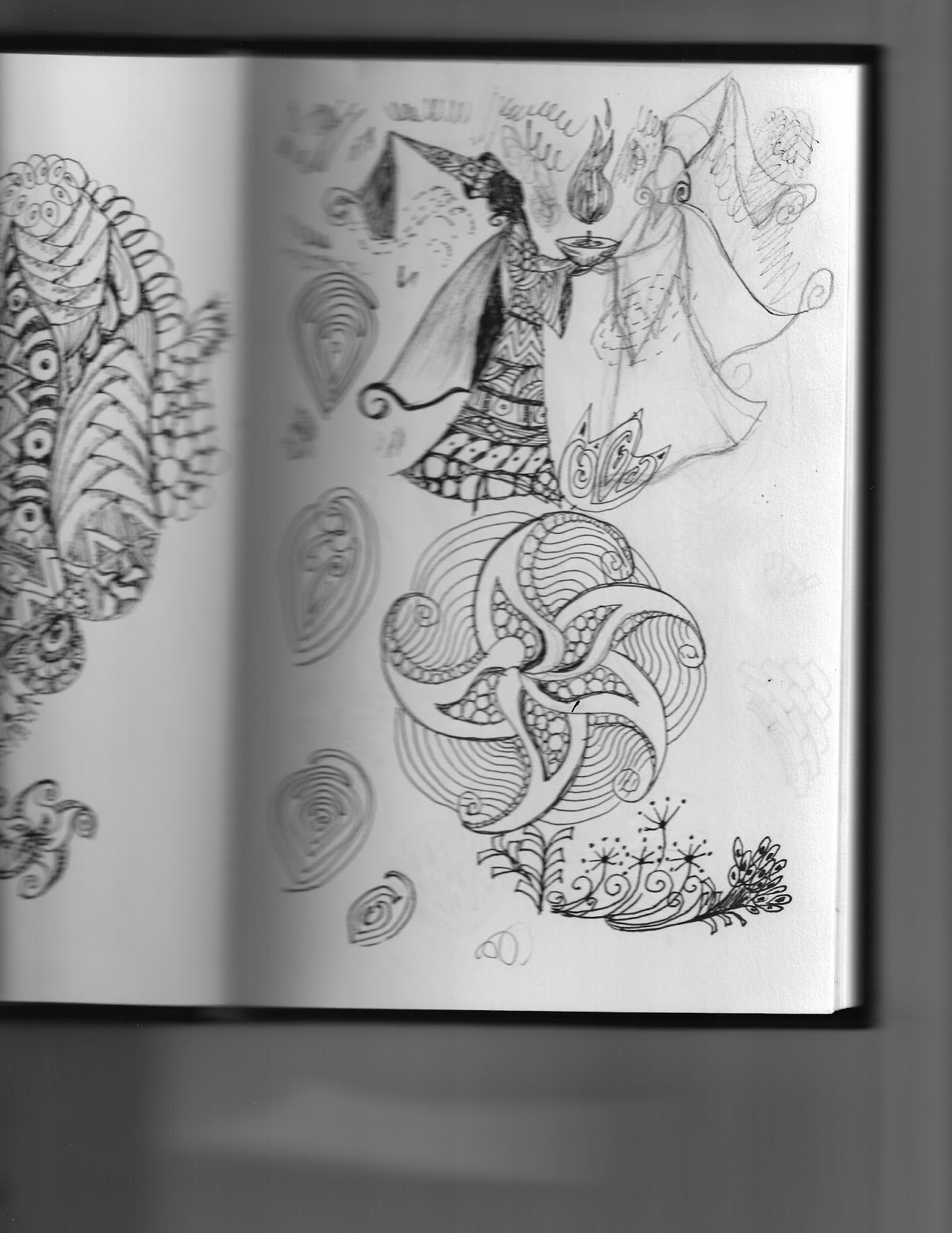
On the news one night there was a segment on the status of starfish, some people know them as sea stars, and their perilous fight for survival.  Or fight for something.  They are dying up and down both coasts of the US. and probably other places, too, but those two for sure.  Furthermore. they were exhibiting very unusual behavior such as tearing their own arms off and eating them.  Ewww.  These poor things are in peril big time.  And, then it hit:  OMG that has to be a sign of something, pollution, change in water temperature or salinity due to the polar ice cap melting, no one seems to know what.  But, wait a minute!  Did I say "a sign of something"?  Yes, yes!  It is a SIGN!  And, to add to the festivities, there is a zen tangle drawing in my sketchbook that might be just what I need.  Ahh, but which sketchbook?  I found it without too much sleuthing:


There it is in the lower half of the page!  Next I traced it onto a piece of acetate and exposed it onto a Solarplate™.  Now, a normal person would have just printed it black on white and been perfectly happy with it.  But, we are speaking about moi.  The first thing I thought was, rainbow roll behind the image - yes I could do that - so I did.


Ummmm, she kind of gets lost in the background - maybe a little chine collé.  After trying a pink and a purple I landed on yellow - most of the starfish I've seen on our coast have been a bright yellow, so that was a winner.  I made an acetate stencil to lay down after the black ink and before the rainbow roll.


Never one to quit before it's too late, if one chine collé is good, how about two?  I just happened to have something perfect in the "white decorate papers" drawer.  So, a wonderful paper with streaks of silver undulating through it seemed to me to be the perfect complement.


The only problem was that the silver from the wonder paper would be forced onto the plate after every trip through the press and it would not come off with anything.  I tried baby oil, turps, mineral spirits, water (which is really not a good thing on solar plate). and finally, in a fit of desperation, De-Solv-It.  Which fortunately did not dissolve the plate, but did get rid of the silver residue, and that stuff had to go because it wanted to collect black ink on the next print and that certainly would not do.  After that problem was solved (no pun intended) I could go on to the last step: a blind embossing of the name STARFISH. (You may have to click on the image and enlarge it to see the embossing.) To my demented mind this signified the disappearance of this oceanic life form, if we humans don't do something to help them out.  Without them how and what will the anemones eat?  

The answer to the theme "Let This Be A Sign" was held in one little news segment on the Nightly News Report.  Who would have guessed?  Well, I'm very glad to have that out of the way and now it is on to the next quandary.  What am I going to do for my Year of the Horse card for the exchange on the Barenforum site?  I'll be watching the news for inspiration.  And, I'm thinking it will be a woodblock print - just for a change of pace and because the fingers are actually feeling pretty good these days!  Just will be keeping those fingers crossed that Arthur Itis doesn't rear his ugly head before I'm finished.


Sunday, February 23, 2014

The Ampersand Project

Sometimes I sign up for things for which there is no rational explanation.  This was one of those times.  And then, to make matters a little worse I had a genius idea for the project: an Ampersand Chicken.  I considered her to be absolutely the most gorgeous Ampersand Chick I had ever seen - the only one, as a matter of fact.  The only problem was that no one I showed it to could find the ampersand.  You be the judge:

I thought the tail was a dead giveaway, but alas, no one else I came in contact with agreed.  So, under a coat of paint she went.  The end product is pretty lack luster and not near as comely as my chick, but there was a deadline and this could not go on forever.  The final submission was:


And that is the end of the ampersand project.  If you look closely you will see one red boot - all that is left of the Ampersand Chick.  Bless her soul, she is resting in peace.

It was a rush to get the above project finished and in the mail before the floor refinishers arrived on the scene to correct the mess from the water leak last October - the one I came back from Turkey to discover.  The restoration company brought a carload of boxes and we started loading them, two or three a day, and carting them to the studio.  Eventually, they showed up and moved the dining room furniture out and we started piling boxes on top of it.  Then they moved the living room out to whatever room was still available in the first studio room and what wouldn't fit there went into the garage.  Boxes of books and family memorabilia were everywhere.

Next was our move to the remaining rooms of the studio, where we were to reside for a week.  I thought, "This will be a piece of cake! I have an edition to print and we can go out to dinner every night courtesy of our insurance premiums."  HA! WRONG - O!  As soon as we were firmly ensconced it started to snow and the following week was nothing but snow and ice.  We were, effectively, snowed in.  It doesn't take much in the Northwest.  We didn't want to go out and have one of those crazy drivers who don't slow down for anything slamming into us, so we just stayed put until the roads were clear.   My edition was pulled and then some.  This is for the Soltice exchange that Charles Morgan curates - the theme is Making a Difference. 

The Winds of Change
Image size  8" x 7" 
Multi plate intaglio a la poupee
Edition of 30
Somerset Satin paper Gamblin Etching Inks
$75.00

The image is based, loosely, on the wheat fields of Eastern Oregon  which, in recent years, have been sprouting wind turbines right and left.  We have a choice on our electric bill to opt for renewable resources for a certain percentage of the bill, which we do.  I hope we are making a difference in our own tiny way.

We are now almost totally moved back in to the house and everything put away where it belongs, or close to it, anyway.  The only thing left is removing the cardboard from under chair and table legs and putting the carpets back down.  That is due to happen tomorrow and when it is complete I'm cracking a bottle of champaign and possibly downing it single handed.  (Hopefully not! I am a terrible drunk - going from tipsy to sickly somewhere between two and three glasses.)

Now it is time to tackle the next project and I am determined to KISS (keep it simple, Stupid) as this last one turned out to be a monster to print cleanly.  After trying everything this side of Mars to allow me to wipe a Solarplate™ cleanly, I finally opted for acetate masks.  They worked, but between the delicate inking and getting the masks to stay in place during their trips through the press, the kill rate was very high!  We'll see if the lesson has been learned….

Tuesday, April 16, 2013

Change of tune

Anyone who knows me can tell you that I change my tune every time I turn around.   And here we go again.  No sooner than the last entry had been posted I had changed my mind about the imagery to use on the heart.  I'm sticking with the girls dancing through the woods releasing birds with reckless abandon, but they will be more on the order of Procession of the Birds:

 And, somewhere along the line, probably on the reverse, will be some expanded version of Keepers of the Flame.
Both are small intaglio prints I did last year using Solarplate™and inking ala poupeé.  Way back at the beginning of time I made little daubers from scraps of an old chamois stuffed with a cotton ball and secured with twine.  They look like simple little dolls in long dresses, which is the translation of poupeé: doll.  They are used to dab the different colors of ink onto the plate before wiping very carefully.  These little dolls have served me well - and, I trust, will continue to do so.  They sleep in an old coolwhip container when not in use.

It will be interesting to see how these women translate into painting.  Well, we should be finding out soon!


Thursday, February 14, 2013

The Last of the Sketchbook

When we left off I was still amidst the Sketchbook - stuck on that high spot in the road, not knowing whether I should just send it off and get to the next project or put a few more (numerous) hours into the works.  If it could have been sent off anonymously I might have done it.  But, it has my name on it.  So,  I couldn't.  More work went into it right up until the moment it had to be winging its way to the East coast.  The cover took on a number of changes:


As did all of the pages.  Additions of a variety of decorative papers, some gouache, some acrylic, some of this and some of that.  Here are a few more examples:


Those of us with printmaking skills are the luckiest people in the world.  How would I ever had made it through the sketchbook project without monotype and etching?  It was so great to be able to put both to use.  A little woodblock would have made it into this, too, had there been time and had someone  handled what time she did have a bit better. 

The next project on the docket is Exchange 55 for the Barenforum.  Starting a new project is always a shot in the arm, and this was no exception - it started off swimmingly, or maybe cravingly.  I happily carved for days, but more about that in the next installment.

Wednesday, June 6, 2012

Keepers of the Flame

Oh yeah, you have to remember to push the publish button when you've finished the post!  These older brains are something else - one would think I had never blogged before.  Apparently, the procedure was in the short term memory and we can see how good that is...

This image, "Keepers of the Flame" is part of the mythology series from Ancient Celtic Mythology.  In doing my research I found many references to the Pashcal Candle of Christianity, and how the symbol was carried on from pagan religions. In the time of the Druids and before, when religions were matriarchal, the interpretation of the candle's light was an honored symbol of Juno, or the local goddess of the moon, stars and sun.  It was believed that she gave newborns their gift of sight.  Personally, I think the candles were all scented and, hygiene being what it was back then, the more candles you could keep burning the better the smell.  My "Keepers of the Flame" represent all those feminine mystics from long ago who, like Motel 6, kept the candle in the window burning.

Keepers of the Flame
7.5 x 8.5
Solarplate™ intaglio
Akua intaglio ink, a la poupeé
chine collé

The long burning candle was also from ceremonial rekindling and encouraging of the new sun at the Winter Solstice.  If the candle extinguished before the specified time it was a sign of bad luck for the coming year.  Roman, Greek and Christians did away with any possibility of that happening by inducting the custom into organized religion and putting someone in charge of keeping that thing burning. The Romans left it up to the temple of Juno and the Christians to the church. Many of the old pagan festivals involving bonfires, torches, candles and other lights were originally dedicated to the Goddess-as-sun, or to the Goddess as controller of the sun and its cycles.  Well, thank goodness we got over that - I would hate to think women were saddled forever with the responsibility of the sun coming up every day.

Tuesday, June 5, 2012

Procession of the Birds

My artist statement says that I am trying to reach back and get in touch with my Celtic roots and that has involved some reading about early European mythology.  Some of the myths I have, more or less, tried to illustrate - not by any forethought of mine, I don't consider myself an illustrator, but it seems to have happened none the less.
Birds play a very important part in these mythologies - everything from being "familiars" (helpers to witches), to being the souls of the dear departed, to being just messengers from a parallel universe.  Feathers were symbols in many ancient beliefs: the early Egyptians believed that every seventh incarnation was a bird, Manx sailors never left on voyage without a feather from the sacred wren. It was traditional to slay wrens on New Years Day on the Isle of Man.  Birds and feathers often symbolized air as one of earth's basic elements. So - birds were important.  The image of a group of women traipsing through the woods  to release the birds came from nowhere in particular, maybe I wanted to free those wrens on the Isle of Man.  Since that particular period in our mythology evolution was one of matriarchal religions  women are everywhere, in all different ages, shapes and sizes and they all dance and sing with reckless abandon.


Solarplate™ intaglio inked a la poupeé
Akua intaglio inks, Somerset Satin paper
7.5" x 8.5"

I've become rather attached to these folks and think they will probably surface in a woodcut now that I have no particular deadline and can take my time!

Sunday, June 3, 2012

Which Witch?

It is time to get around to posting again - it seems like years since I've entered anything.  Come to think of it, I was always like that with diaries, too.  Xmas would come and I would always get at least one and in the end I have a library of diaries with entries through the first two weeks of January and blank from then on.  That was mostly because I felt that my life was so mundane and uneventful that there was nothing interesting to write.  Little did I know that those would be among the most interesting days of my life!

But, just because I haven't been writing doesn't mean nothing has been happening around here.  Which Witch? was a fairly easy print to compose, but getting that black, black, blue black background was a bit tricky.  And finding the right chine collé paper was a task with pitfalls, too.  Paper too thin, too thick, not the right color - eek.  Finally, I went with what I had in the drawers and was pleased with the way the green grapes and the table cloth compliment.  At the opening of the exhibition Friday night I was amazed at the number of people who couldn't find the witches even when they were pointed out!


Which Witch? is a Solarplate™ print measuring approximately 14" x 16.5" and printed intaglio.  Incidentally, those witches are both very nice, gentle people, strictly vegetarian, maybe a glass of potion now and then, but basically of high moral character and pillars of their respective covens.  Nothing to fear from these two - they haven't cast a spell in so long that they have completely forgotten all incantations.  They were good studio mates and kept up an interesting banter throughout the process.  ;-)

Tuesday, March 20, 2012

Copper Complete

The Foredom has been grinding away, relentlessly, turning a lovely piece of copper into dust.  Yeah! we have an image - and one that I think conveys the tranquility of Tryon Creek State Park.  It is difficult to get a good photo of a metallic surface, but I hope you can tell a little of what is intended from this shot.


This piece is intended to exist as the copper plate mounted onto the exterior of a house.  But, there are some pretty interesting passages and I had to know how these marks might translate to paper.

detail from copper plate


So, I pulled a print using Akua Carbon Black -  the wonderful part of that is that after the print is pulled the plate cleans with soap and water and very little elbow grease (which is more than I can say for wiping the plate prior to printing!  I thought my arm was going to drop off.)


Obviously, this was not what I would like if this were intended as a print, but in this instance I think there is 
a lot to work with and as soon as the ink is dry I am ready to dive in and see what I can come up with.  Meanwhile, though, some of the marks translated quite differently than I would have thought.  Some are really dark, and some are quite transparent and almost fragile. 

detail from print

This little detail will give me something to muck about in and see what works and what doesn't.  Meanwhile, though, I think the copper will stand alone and that is what matters.  The Foredom will enjoy a nice rest.  


Friday, February 10, 2012

Copper Engraving

Good grief! It has been ages since I've written anything.  Between travel, Christmas, Colds, and general winter lethargy, not a whole lot has happened.  But, I couldn't put off getting this copper piece started any longer.  Hopefully, it will be the engraved plate which is its primary purpose, AND I will be able to get a print off of it for my show in June, which I am really supposed to be working on.  It is pretty slow going and I can only stand to work on it four to six hours a day - my back seems to feel it is obligated to set up a major screaming session if I try to push it any further.  So, here is as far as we have made it after about 4 days of work:


The section under the newsprint will be the next part and will be started this weekend.  Meanwhile, I am off to Ink and Drink at Atelier Meridian this evening.  My son and I are going to sneak off and "smash hearts" (make valentines for our respective spouses).  Should be great fun!

Monday, June 28, 2010

Support Group, again,again


I'm hoping that the third time is a charm.  This print has been trying (and succeeding very well) to drive me crazy.  I could not  understand what it was that was nagging non-stop.  Finally, a friend said she thought that the central figure was too dark.  I looked closer and the original drawing was not dark, so I must have over-developed the plate.  Back to platemaking and a 30 second developing time and this is so much better.  It reminds me of a story another friend, who just happened to be a poet, told me years and years ago.  She said she had a friend who helped her with her poetry and the problem was always the line above or below the problem line, and never the "problem line" at all.    Right after that I was painting a portrait commission and could not get the nose right.  Finally, I redid the mouth and the nose was fine.  Such was the case with this print.  I thought it was the amount of white space that was wrong, and it was instead the darkness around the hair and face of that center figure.  Thank you to my good friend for turning me around! Another lesson learned again.  I don't know if I have time to learn every lesson over and over and over.  I would really like to get to that woodblock someday.  

I'm assuming everyone recognized these three women as the Three Graces: Aglaea (beauty), Euphrosyne (mirth), Thalia (good cheer).   This image has the central figure, Aglaea, needing her support group.  She is traditionally the grace dealing with beauty and is also the oldest, so I'm wondering if she is worried about losing her beauty because she is aging.  Maybe she is considering a face lift... or maybe not.  I'll leave it to the viewer to make up the story.
;-)

Saturday, June 26, 2010

Support Group, again

I wasn't real happy with the first version of Support Group, so I've tried one with more white space.  I'm still not a hundred percent, but maybe this version will grow on me.  Suggestions are welcome - including, redraw the main image.  I'm still planning to work more with this idea in a different format  and a bit larger.  The next one will include carving and probably be mainly woodblock, since it will be part of my "recuperation project # 1".  If not wholly woodcut, then maybe the color blocks with a solarplate for the line.  As you can see, this is still rolling around in the little gray cells.

       It reminds me of the metal garden sculpture I lost last night: it was made of cut outs of leaves and was spherical.  I accidently kicked it, just the tiniest bit, and off it went, down the incline, weaving its way between the Japanese forest grass, and down between more plants - any one of which could have stopped this thing - across the flagstaff path, between two large shrubs and then it was really off and running down the embankment, between cedar and fir trees, over the vinca minor, and through the horsetails and ferns and now it is lost.  I went as far down the hill as I could with a bad knee and in Berkinstock sandals which only go ahead, not back or sideways.  The further I got down the hill and the closer to the creek the more tangled the undergrowth became, so I had no choice but to climb back up.  This is not easy when one keeps sliding out of ones shoes.  Now I'm looking for someone with a metal detector, or will wait until fall, when the lost sphere, in its rusted glory, will  probably become very obvious.  Sigh.

Thursday, June 24, 2010

Vancouver's Printmakers: Pressing the Boundaries


This is a show I've been working on for a couple of years - the idea being to showcase half a dozen or so local printmakers.  Part of the idea is to introduce the printmakers and their work to a larger audience and the other part to educate the public about printmakers.  In this show we have about an even split between relief and intaglio with some monotypes thrown in to make a terrific mix.  Vancouver has been having  really good turnout for the First Friday Art Walk - we hope that will hold true even though it is a long holiday weekend. ( Hold your breath! )
There will be fish printing for adults and children going on in front of the gallery and Barbara Mason has agreed to bring the small press and demonstrate intaglio in the gallery.  With all that, lots of terrific prints,  a little wine and some good food it should be a terrific evening.  If you're in the area the date for the opening party is July 2, 5 pm - 9 pm.  Hope you can make it!

Wednesday, June 23, 2010

Support Group

Lately I've been putting up with a knee that has decided to join the other side.  Way back when I was knee high to a grasshopper I was in an auto accident and my knees were slammed into the dashboard of one of those old cars that had knobs that stuck out.  This was way before seat belts and air bags.  At the time the doctors told me I would probably have trouble with the knees when I got older.  Since that was about a hundred years away, give or take, I didn't give it a moments thought.  Well, guess what?  That "older" business has caught up with me.  Anyway. long story short – it is down to bone on bone and time for joint replacement.  But, that can't happen until mid-August.  Meanwhile, though, I have a fantastic support group.  Everyone needs a good one of these – they are worth their weight in gold.

So, of course, this warranted a print.  This is multiple plate intaglio and chine collé.  I'm working on another one along this same vein which will be larger and a woodcut, probably.  I think it will be my recuperation project for after the surgery.  I will get everything ready to go before I go under the knife.


While working on this group of prints, the poetry muse must have passed through the area and the next thing I knew I was up to my neck in Haiku.  I, of course, know nothing about poetry, but that has never stopped me from doing anything else, so it didn't stop me from this either.  Although, I did consult the Baren.com Poet Laureate, Bette Wappner, and sent me to a website that was very useful.  In usual form, though, the deadline was approaching and I didn't have time to really study the subject.  (Must do that in the near future.  Maybe another recuperation activity.)  This is my try at Surinomo - the Japanese prints which included poetry.

Monday, September 14, 2009

New Work

A lot has happened around here in the last couple of months and sandwiched between the earth shaking events of daily life I've managed to find a little studio time to produce some new work. Because I've been having so much trouble with my hands (ugly old arthritis) I've temporarily given up on woodblocks and been indulging in solarplate™ intaglio. With this medium all you need to do is get the desired image onto a transparent format and you're good to go. I like to draw directly onto aquaeous media acetate. It allows you to remove and add to your heart's content, take as long as needed, and then just expose it onto the plate using UV light, develop the plate in tap water, harden with a little more UV and print. In this case I've printed many layers of colors and textures and stenciled some blocks of color onto both sides of a very thin, transparent mulberry paper, then printed some small plates on the paper's right side. Meanwhile, I've printed the drawings/images onto another piece of fairly transparent (but not as much as the original paper) and very carefully torn around the image while the paper is damp. Mulberry paper is very tough and almost impossible to tear when it is dry. When dry the images are dampened again, sprinkled with adhesive and placed on the background sheet on a plate and run through the press. Then I may print a bit of color over the top of the two sheets which have now become one. When the image is completely resolved it is trimmed and chine collé to a Western printmaking paper - I like Somerset Satin. It is versatile and has a nice hand and is a soft white. The image above is named Persephone after the ancient myth of Demeter's daughter having eaten a seed of the pomegranate while in the underworld (she was forbidden to eat anything if she wanted to come back up topside) and thereafter having to spend 3 months down under (winter) and the other 9 with us (spring, winter and fall). Her mother brokered that deal. So, she is here with her scythe, watering can, rake, and a few samples of what she's grown so far. Since we have gone from "yard" (rather shabby & kind of unkempt) to "garden" (a place to be kept free of weeds, moles, voles, slugs and looking decent) I see that three of my new images deal with gardening and critters. As you can see there is no mercy in my heart for voles. I don't understand why they were invented in the first place and am certain that the world would be a better place if they were not here. The varmints live on the roots of your most expensive plants. They will gladly pass weeds by giving them nary a thought. They can completely wipe out a yard in a heartbeat. One day your plant is looking robust and healthy and the next day it falls over dead & has no roots. My plan is to lead a hunt and not look back until they are all gone. However, my feeling is that one pregnant vole will always be missed and before you know it you will be infested again. They were probably here with the dinosaurs and will still be here with the cockroaches long after we are gone and forgotten. But, while I'm here I will be doing my best to win the fight.